Last Thursday was the last free day we could go to Deanna Rose Farmstead for the season.
So we went. Thankfully, the weather cooperated!
The whole place is chalk full of beauty!
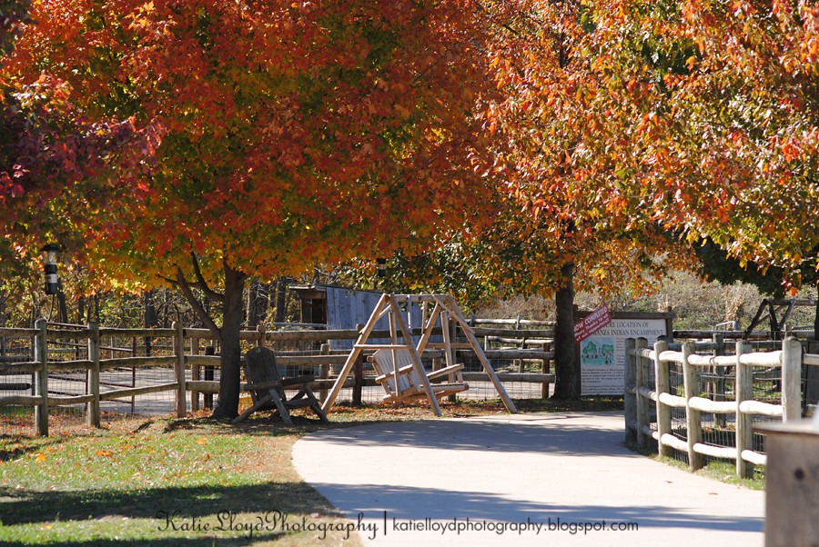
This one part of the path caught my eye.
Before:
So we went. Thankfully, the weather cooperated!
The whole place is chalk full of beauty!
This one part of the path caught my eye.
Before:
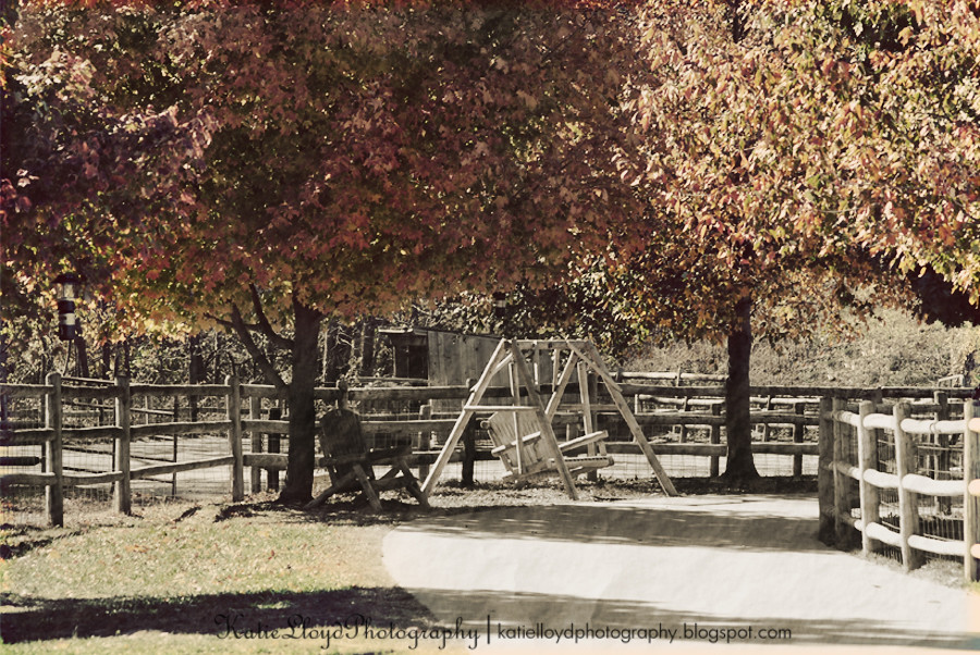
After:
As I'm now looking at this edit in a smaller version, I think it needs something extra - like a dark and distressed border with a super scratched up texture overlay to really give it an old photo look.
But my mind is stuck in "good enough" mode and has been for at least the past week, so this photo will probably never see that extra bit of distress, for which it's so desperately asking.
I'm trying hard to kick it back into more of a "do your best" mode, but the dang lever must be stuck.
...thanks for bearing with me...
I use PSE 8 and did the following steps:
Step 1: Used clone tool to remove the large sign.
Step 2: Cropped out the box from the lower right corner.
Step 3: Ran PW's Seventies action
Step 4: Then ran PSE's Old Photo action
Step 5: Lightly erased the old photo action from the trees and grass.


I like it. Great job. I think it would look great with a texture and frame. You should do it!
ReplyDeleteoh - love this edit!
ReplyDeleteSuch a great shot, but then the edits are amazing!!!!
ReplyDeletevery nice.
ReplyDeletethe edit really suits the picture - beautiful
ReplyDeleteYour Edit really makes image feel peaceful!
ReplyDeleteVery cool. Something different.
ReplyDeleteI really like what you did here. Instead of going crazy with the color, you went the other way, and made it very interesting! I would have been tempted to make those leaves even more colorful - too predictable. This is great! :-)
ReplyDeletezLove it... and ya know I love that farmstead. You photographed one of my favorite places there. Well done on your edit.. but I love the SOOC the most.
ReplyDeleteThat's awesome! I love it!!! I'm following you now from Before/After!
ReplyDeleteI agree with karli... I think it would be hard for me not to use soo much color. But I do like it.... hmmm... maybe I will have to shy away from my color.
ReplyDeleteYou did a great job removing the sign and I love the old vintage feel you went with.
ReplyDeleteThis looks fantastic! I'm so impressed with how seamless your cloning works for taking out that sign. Great job!!
ReplyDeleteI love the way you desaturated the colours like that and the cloning is seamless!
ReplyDeleteThis comment has been removed by the author.
ReplyDeleteGreat photo.
ReplyDeleteLouis
love the rustic feel of second edit. What a pretty place that seems to be.
ReplyDeleteI love the edit, works really well for the shot.
ReplyDeleteWonderful edit - I like them both, actually!
ReplyDeleteGreat job cloning out the sign! I think the tree color needs to be brought in more...
ReplyDeleteI was going to say the same thing - I cannot believe how well you edited out the sign!
ReplyDeleteI think it is great! I have PS Elements 8 and did not know about the "old photo" action. I'll have to check it out!
ReplyDeleteThey're both so pretty!
ReplyDeleteNow you know I can't go without asking a question...how in the world do you do the cloning so well?? I hate that clone tool. I can never seem to make it work right! Aaargh! This is a beautiful edit. I love it!!!!
ReplyDelete