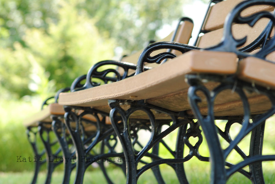
I shared a clean edit of this bench a few days ago for Scavenger Hunt Sunday.
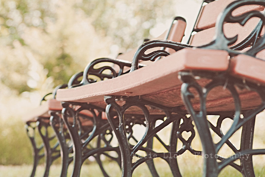
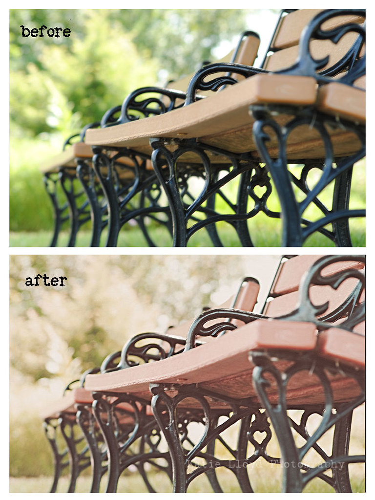
I know the focus is off - and not in a good way, but I really like the image all the same. Today I wanted to share a much different look for this image.
Before:

After:


I use PSE 8 to edit and may have done the following:
(please note that my memory is awful and these steps are not necessarily in order...or accurate.)
1. Add some kind of Kim Klassen texture...I think.
2. Adjust hue to be a bit more red (this I know I did!)
3. Possibly lightened midtones with levels.


Ooooh I really like that!
ReplyDeleteBenches are a favorite subject of mine. I do like both shots.
ReplyDeleteOh, I really love that edit! That's great!
ReplyDeleteOh, I really love that edit! That's great!
ReplyDeleteI've had that memory thing happen to me recently! Beautiful edit!
ReplyDeleteLove the edit! :D
ReplyDeleteI love the coloring of your edit. Looks vintage!
ReplyDeleteAwesome edit.
ReplyDeletereminds me of cross processing from the film days of developing.. Love it!
ReplyDeleteThe edit is great! It ties it all together to where the focus isn't so dominant. Very nice!
ReplyDelete